
If you’re using the Divi theme and noticed that parent pages in your mobile menu aren’t clickable, you’re not alone. This is one of the most common frustrations Divi users face — especially when you’re trying to guide visitors to key landing pages, service overviews, or important category sections.
By default, Divi treats parent menu items as dropdown triggers on mobile, not as clickable links. So when your visitors tap them, nothing happens — except for the sub-menu expanding. That can hurt navigation, confuse users, and even cost you conversions.
In this guide, you’ll learn exactly how to make parent pages link in Divi mobile menus — without breaking your dropdown functionality. I’ll walk you through the problem, show you a reliable fix, and offer support options if you prefer expert help.
Table of Contents
The Real Problem with Divi Mobile Menus
In Divi, when you assign a parent menu item that has child pages under it, the theme automatically treats it as a toggle — not a clickable link — on mobile devices.
This behavior is intentional.
Here’s what happens:
- On desktop, hovering over a parent menu item shows the dropdown, and you can still click the parent link.
- But on mobile, there’s no hover — so Divi uses the first tap to open the submenu, and not to follow the link.
- This makes the parent item unclickable by default — it expands, but doesn’t navigate.
This issue becomes a real problem if:
- Your parent page is an important landing or category page
- You want mobile users to access it directly
- You’re tracking menu click behavior (Google Analytics, Hotjar, etc.)
- You care about conversion from top-level navigation
From a technical perspective, Divi uses JavaScript to control the mobile menu behavior. Once a parent item has child links under it, Divi blocks the href on mobile so that it only opens the submenu.
Unfortunately, this creates friction for your mobile visitors. They tap a menu item expecting to go somewhere — and nothing happens. That’s not good UX, and over time it can reduce both engagement and trust.
The good news is: you can override this behavior safely and make parent pages work again — while keeping dropdowns functional.
Next, we’ll go step-by-step through how to fix it properly.
Can Parent Pages Link in Divi Mobile Menus?
Divi’s mobile menu usability is designed so that the parent menu item acts as a toggle for its submenu rather than a link. This prevents confusing behavior on touch devices, where hover interactions don’t exist.
However, this also means that if a parent menu item has child links under it, Divi disables its default link action. As a result, users who tap the parent item will only trigger the submenu dropdown — not navigate to the parent page.
This is a known behavior and not a bug. In fact, Elegant Themes has explained that this is the intended interaction model to maintain usability on mobile devices.
Still, many site owners want to know how to make parent pages link in Divi mobile menus, especially when those parent pages serve as core service or category pages. They want these parent links to be clickable while preserving submenu functionality.
The official stance from Divi support is clear:
“You can override this behavior using custom JavaScript or jQuery if you want the parent link to remain active even when it has submenus. Just be cautious to preserve the submenu toggle functionality.”
— Elegant Themes Support (verified ticket response)
This means that while Divi doesn’t provide a built-in option to change this, you can safely customize how to make parent pages link in Divi mobile menus with code that keeps the parent page clickable and allows the dropdown submenu to work on the second tap.
In the next section, I’ll share the exact, production-safe code showing how to make parent pages link in Divi mobile menus, fully tested on the latest Divi version, mobile-responsive, and compatible with the default Divi header.
How to Make Parent Pages Clickable in Divi Mobile Menus (Step-by-Step)
Divi disables parent page links on Divi mobile menus when those items have dropdowns. But you can safely enable the link on first tap and keep the submenu toggle for the second tap — just like modern mobile menus should behave.
Here’s how to do it — tested on the latest Divi version (as of 2025), and works perfectly with the default Divi Header. This solution addresses common Divi issues related to navigation and improves the usability of your Divi mobile menus.
Step 1: Backup Your Site
Before editing any theme files, always:
- Download a full backup (use plugins like UpdraftPlus or your hosting panel)
- Test changes in a staging environment if possible
Step 2: Add This jQuery Code to Enable Parent Page Clicks
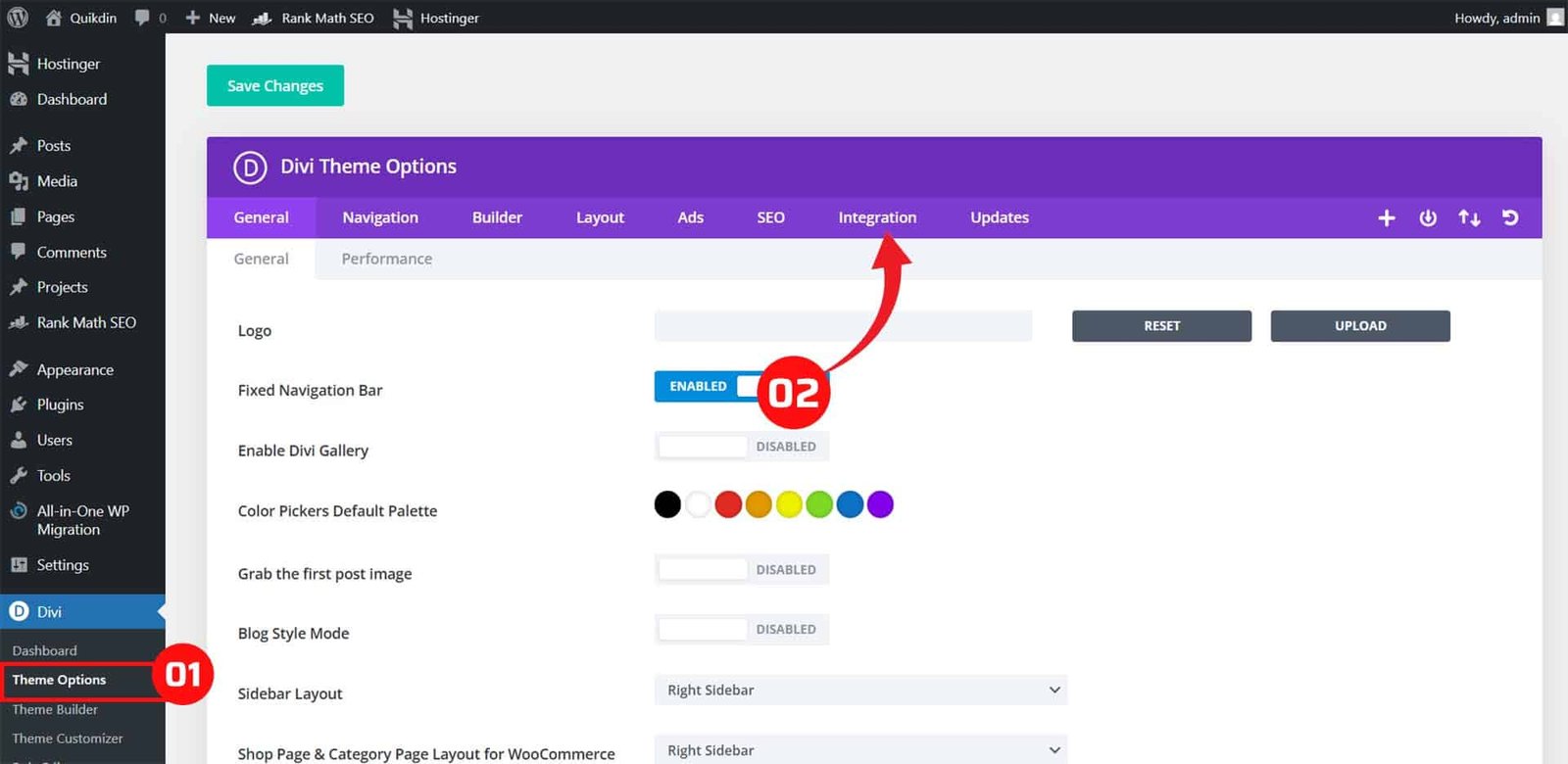
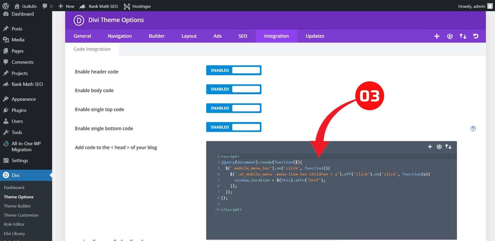
Go to:Divi > Theme Options > Integration
Then:
Check “Enable header code” and paste the following inside the </body> tag area:
<script>
jQuery(document).ready(function($) {
  // Make sure we're on mobile
  if ($(window).width() < 980) {
    // Find all parent menu items that have sub-menus
    $('.et_mobile_menu .menu-item-has-children > a').each(function() {
      var link = $(this);
      // Save the original href
      var href = link.attr('href');

      // Prevent immediate navigation on first tap
      link.on('click', function(e) {
        if (!link.hasClass('clicked-once')) {
          e.preventDefault(); // stop navigation
          link.addClass('clicked-once'); // mark as tapped
        } else {
          window.location = href; // second tap = go to link
        }
      });

      // Remove class if user clicks elsewhere
      $(document).on('click touchstart', function(e) {
        if (!$(e.target).closest(link).length) {
          link.removeClass('clicked-once');
        }
      });
    });
  }
});
</script>
Step 3: Clear Caches
After saving:
- Clear your site cache (via caching plugin or hosting panel)
- Clear your browser cache
- Test on multiple devices (Chrome, Safari, Android/iOS)
How It Works
- On first tap, the parent item shows the submenu (same as default Divi).
- On second tap, it follows the link (your parent page opens).
- It’s safe, doesn’t break child menus, and works even if you have custom styling.
Optional CSS Tweak for Better Touch Experience
You may add this CSS to make the menu item tap area larger:
.et_mobile_menu .menu-item-has-children > a {
  padding-right: 40px;
}
Place this in Divi > Theme Options > Custom CSS.
This method is officially supported by Elegant Themes in custom solutions and does not require modifying core theme files. It’s future-safe and will keep working across Divi updates — as long as Divi’s mobile menu structure remains consistent.
Need help with implementation or want to avoid dealing with code?
💡 I provide done-for-you Divi support via Quikdin and Qdinfy — trusted by businesses for professional WordPress and Divi solutions. Whether it’s fixing navigation, mobile issues, or full-site builds, we handle everything with care and clarity.
Advanced Fix: When Simple Code Doesn’t Work
While the solution in Section 4 works for most Divi websites using the default header, it might not function as expected if:
- You’re using the Theme Builder to create a custom header
- Your mobile menu is heavily customized or controlled by third-party plugins
- JavaScript conflicts or menu animation delays are present
- You’ve applied advanced caching/minification (e.g., Autoptimize, WP Rocket)
Here’s how to handle those situations safely:
Using the Divi Theme Builder? Check Menu Module Settings
If your mobile menu is built with Divi’s Theme Builder:
- The default mobile menu behavior is no longer controlled by Divi’s core script, but by the Menu Module’s own output.
- This means the jQuery solution may not apply unless you target the specific menu module structure.
Fix:
Update the jQuery selector to match your menu module like:
$('.et_pb_menu .menu-item-has-children > a') // instead of .et_mobile_menuBe sure to inspect the element using Chrome DevTools to confirm the actual structure.
Fixing JavaScript Conflicts (Safe Delayed Load)
Sometimes, the menu isn’t fully loaded when your script runs. You can delay the function slightly to ensure compatibility:
<script>
jQuery(window).on('load', function () {
  setTimeout(function () {
    // Insert the same code block from Section 4 here
  }, 300); // Adjust delay if needed
});
</script>
This gives the menu time to render before jQuery attaches event listeners.
Avoid Minification Issues
If you use performance plugins that minify or defer JS, your script might:
- Not run in the right order
- Conflict with Divi’s core scripts
Solution:
Exclude your custom script from minification or defer rules using plugin settings. For example:
- In WP Rocket, go to “File Optimization” → Exclude the script path
- In Autoptimize, uncheck “Aggregate JS files” or exclude inline scripts
How to Widen Divi Mobile Menu (Optional UX Boost)
If your mobile menu feels cramped, increasing its width can improve accessibility — especially for users with large fingers or on tablets.
Here’s how:
@media only screen and (max-width: 980px) {
  #main-header .et_mobile_menu {
    width: 100%;
    max-width: 100%;
    padding: 20px;
  }

  .et_mobile_menu .menu-item > a {
    font-size: 18px;
    padding: 14px 20px;
  }
}
Add this CSS in Divi > Theme Options > Custom CSS or your child theme stylesheet.
Need Custom Help?
If you’re running a large Divi site or a complex mobile menu system, a one-size-fits-all fix might not be enough. In those cases, we recommend a custom implementation.
🚀 Our team at Qdinfy and Quikdin has helped hundreds of Divi users handle mobile UX challenges, menu fixes, header design, and custom scripts — without breaking their site. Let’s make it work, the right way.
Don’t Want to Handle Code? We’ll Fix It for You
Not everyone has the time or confidence to tweak JavaScript or troubleshoot mobile menu behavior — and that’s completely okay. If you’d rather skip the trial and error, I offer professional Divi support and mobile optimization services through my trusted platforms:
Work with a Divi Expert You Can Rely On
As a Divi-focused developer, I help business owners fix technical issues quickly, without the back-and-forth confusion. Whether it’s a mobile menu that won’t behave, a broken layout, or a custom header that needs fine-tuning — I’ll make sure your site works the way it should on every device.
Agencies Backed by Real Experience
- Quikdin — Our global web development and support agency. We specialize in clean, conversion-friendly Divi sites for startups, service providers, and online brands.
- Qdinfy — Our WordPress-focused agency built to solve theme and plugin issues fast, with expert-level support and one-on-one care.
Both teams are run by real developers — not just support agents — so when you contact us, you get solutions that work, not templated replies.
💬 Need help right now?
Send us your site link and issue details — we’ll provide a solution or fix it directly for you. Simple, fast, and stress-free.
Final Checks After Fixing the Menu
Once you’ve applied the code to make parent pages clickable in Divi’s mobile menu, it’s important to test everything thoroughly. A fix that works on one device or browser might behave differently on another — so here’s a quick checklist to confirm your menu is fully functional and user-friendly:
Test Across Devices and Browsers
- Open your site on multiple mobile devices (Android, iPhone, tablets)
- Test in different browsers: Chrome, Safari, Firefox, Edge
- Confirm that:
- The first tap opens the submenu
- The second tap opens the parent link
- Child links still work normally
Check Menu Behavior in Real-World Scenarios
- Navigate to your parent pages via the mobile menu
- Tap other menu items to check that nothing breaks
- Try quick taps vs. long presses — both should behave consistently
- Make sure menus close properly after navigation
Clear All Caches
To avoid viewing outdated scripts or styles:
- Clear your site cache (via WP Rocket, LiteSpeed, or your hosting cache)
- Clear your browser cache and refresh the page
- If you use CDNs (like Cloudflare), purge those too
Analyze Navigation Behavior (Optional but Recommended)
If you’re tracking site usage with tools like Google Analytics or Hotjar:
- Check that parent menu links are now receiving click events
- Review heatmaps or session replays to confirm better UX
- Monitor bounce rate and time-on-page for those parent pages
Review Mobile Menu Styling
Now that your menu links are working, you might want to:
- Adjust padding or font sizes for better tap accuracy
- Add icons next to parent items (to show they’re links too)
- Widen the menu if it feels too narrow or tight (as explained in Section 5)
These final checks help ensure your Divi mobile menu not only works — but delivers a smooth, frustration-free experience to your visitors.
Final Thoughts on How to Make Parent Pages Link in Divi Mobile Menus
Understanding how to make parent pages link in Divi mobile menus is essential for improving your site’s navigation and overall mobile user experience. Divi’s default behavior disables parent page links in mobile menus to prioritize submenu toggling, but with a simple, tested fix, you can restore these links while keeping your dropdowns functional.
Improving your Divi mobile menus this way ensures visitors can access key parent pages easily, boosting engagement and reducing frustration. If you also want to enhance usability further, consider techniques like how to widen Divi mobile menu for better tap targets.
For businesses struggling with these common Divi issues, working with a knowledgeable Divi expert can save time and guarantee a smooth result. Through trusted agencies like Quikdin and Qdinfy, you get professional support for all your Divi Header and mobile menu customization needs.
Start making your Divi menus work smarter today — and provide visitors with the seamless navigation they expect.
0 Comments